User parameters
Introduction
User parameters are the building blocks of the configurator. Without them, the user would not be able to configure their product.
Create offers a range of user parameters which enables lots of options and functionalities. This document will elaborate on all possible user parameters and what they are most used for.
Content
Explanation
Overview
Depending on the TwikBot used, the parameters might look slightly different.
Node | Name | Description | Use |
|---|---|---|---|
Option parameters Choose between different options | |||
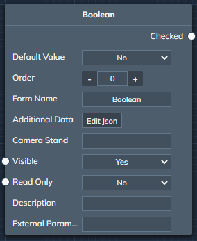 | Boolean | A boolean parameter can switch between two states, check or unchecked. In Create this translates into a true or false statement. | When something needs to be turned on or off, the Boolean parameter is the one to use. |
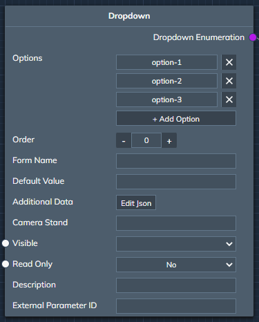 | Dropdown | A dropdown allows for an indefinite amount of options. These options are usually shown in a dropdown style as well in the front-end user interface. Should always be followed by a Value interpretation | When a user can choose between different options that do not necessarily have a visual effect on the product or where icons would not necessarily have an added value, a dropdown can be used.
|
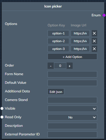 | Icon picker | The icon picker is very similar to a dropdown, with the addition of an icon per option. The icons are linked in the “Image Url” parameter, a Url should be used that links straight to that icon file. Example: https://via.placeholder.com/150/0000ff/000000?text=Twikit Should always be followed by a Value interpretation | The icon picker is most often used for choosing options that make a visual difference. Examples are:
|
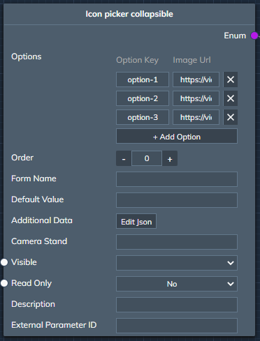 | Icon picker collapsible | The icon picker collapsible is again very similar to the icon picker except for it being collapsible. All options can be seen by expanding the icon set. This is especially useful when many options are available. Should always be followed by a Value interpretation | Similar to the icon picker but different UI. When a lot of options are available, but not a lot of space is wanted in the initial UI, this is the preffered option. |
Numerical parameters Set a number | |||
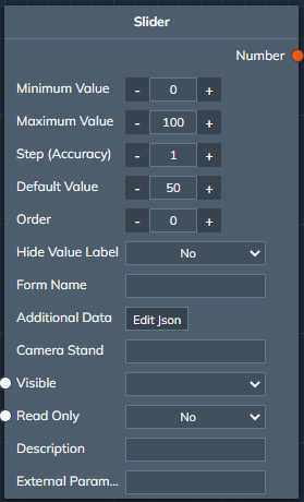 | Slider | The slider sets a number, depending on where the marker is on the slider. A user can slide the value left or right in between the min and max values set in the parameter. The minimum and maximum value should be reached when subtracting or adding the Steps value to the Default value. The Default value Should be in between the Minimum and Maximum value. | When a number is needed as a way of scaling or Moving something, a Slider param can be used. |
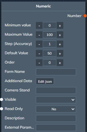 | Numeric | The numeric parameter allows a user to enter a number between the minimum and maximum (including) value set in the parameter. The value should be reachable with the steps starting from the minimum and maximum value, if not, it will jump to the closest value. The minimum and maximum value should be reached when substracting or adding the Steps value to the Default value. The Default value Should be in between the Minimum and Maximum value. | When an exact measure is needed, the Numeric parameter is the go-to parameter to be used. |
Text parameters Enter text | |||
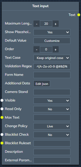 | Text input | The text input allows a user to enter one line of text. Multiple restrictions in this line, like Maximum length or Validation Regex can be applied in the node. | When the user is allowed to fill in a single word or a short one line of text, the Text input is used. |
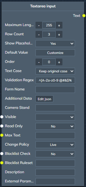 | Textarea input | The text input allows a user to enter one or more lines of text. Multiple restrictions in this line, like Maximum length or Validation Regex can be applied in the node. | When more than one linne of text is allowed to be filed in, the Textarea parameter should be used. |
Resource parameter Upload a resource | |||
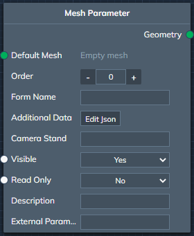 | Mesh parameter | The mesh parameter allows the user to upload their own mesh or 3D file. This can be an OBJ or STL file. | When a scan is needed to personalise the product, the Mesh parameter is the needed parameter. |
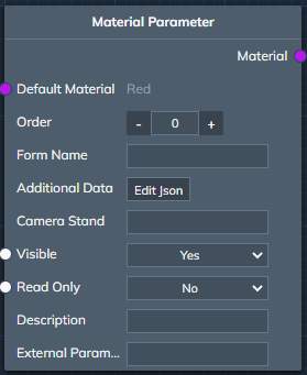 | Material parameter | The material parameter allows the user to upload an MTL file. | When custom materials should be uploaded by the user, the Material parameter should be used. |
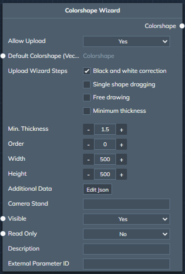 | Colorshape wizard | The colorshape wizard allows a user to upload a colored image. This image can then be used as a “Colorshape” in Create. | When both the color and the shape is needed in Create, the Colorshape wizard is used. |
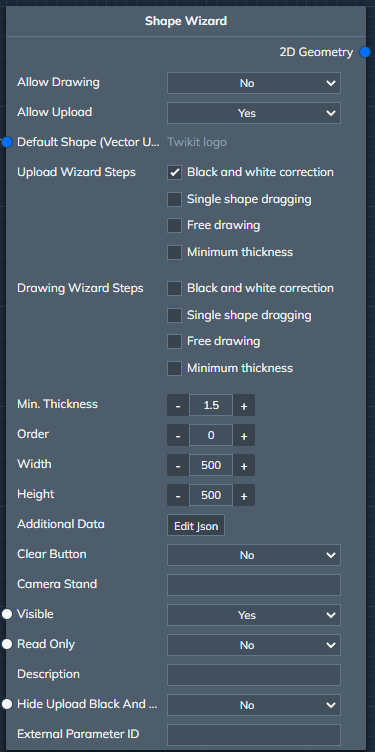 | Shape wizard | The shape wizard allows a user to upload a colored image, but only keeps the shape of the colored image (after black and white correction). The uploaded shape can be used as 2D geometry in Create. | When for example the shape of a logo is needed, the Shape wizard will extract the shape out of an uploaded image file. |
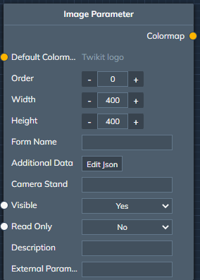 | Image parameter | The image parameter allows a user to upload an image which is then used as a colormap in Create | When only the colors of an image is needed, the Image parameter is used. |